Make a speaker portrait with room for event text
The event team wants your photo and talk title on one banner by Friday. A lovely portrait is a poor banner if the title lands on your face.
What you'll make
a portrait backdrop with the person on one side and clear space on the other, tested with your real heading at the sizes people will see.
What you'll need
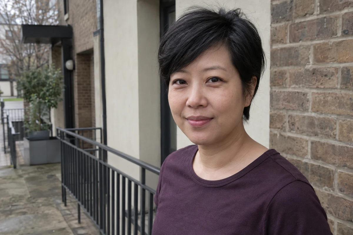
a clear photo the speaker has agreed to, an image editor your organisation lets you use (ChatGPT and Gemini both edit attached photos), the real heading and a page or slide editor that keeps words editable. To practise, use the fictional walkway photo.
Example result.
1. Give the destination a shape before editing
Get the real dimensions or aspect ratio — the relationship between width and height. A 3:2 image is one and a half times as wide as it is tall, a 16:9 slide is wider, and a square tile has the least room for a face and a title together.
Sketch two regions: the person’s head and shoulders, and a quiet area for words. Keep the event wording in your page or slide editor, not in the image. Names, dates and spelling stay easy to fix, and screen readers can read real text. You shouldn’t need to regenerate a face because the venue moved the start time.
Why this works: the image editor only has to make a backdrop, and the words stay in a tool that is good at words.
What you should see: a ratio, a side for the person and a side for the text.
2. Specify the person and the blank region
Attach the untouched photo and ask for one candidate. The photo needs enough real hair and shoulders for the frame; the About-page portrait guide explains what to do when it doesn’t.
Edit my original photo for a [ratio] event-speaker layout.
Keep the source face, apparent age, expression, hair, natural skin
appearance, clothes and accessories. No invented hands or body.

Place the person on the [left / right], with complete hair and
clear space above it. Leave a quiet region on the other side for
a heading of [heading length], added later as editable text. Keep
that region free of the person, props, detailed background and words.

Use [quiet setting]. Generate no text or logos.
Make one candidate for me to test with the real heading.
[ratio] is the destination shape, such as 3:2. [left / right] is the person’s side. [heading length] is a rough description, such as “two lines, about 60 characters”. [quiet setting] is the backdrop, such as “a pale mint wall”.
Why this works: “person left, text right” plus a real heading length gives the model a practical layout to aim for. A percentage in the prompt is something to check, not a guarantee.
What you should see: the same person on one side, with a plain area wide enough for your heading.
3. Test real words, not short placeholders
Put the real heading, name and date on the image in your page or slide editor. Then shrink it to the smallest size people will use, such as the mobile event page. Short placeholder text fits where a real title wraps across the face.
Check the person against the original before you judge the layout, then check hair, shoulders, text clearance and contrast.
Why this works: the failure only appears with the real words at the real size, so that’s what you test.
What you should see: the heading clear of the face and hair at every size you’ll publish.
Check the result
- The face, hair, expression and clothes match the original.
- The whole head fits, with some space above the hair.
- The real heading stays clear of the face at the smallest size.
- The text is readable against the backdrop all the way along.
The usual failure: the layout works at full size and breaks in another crop. A wide banner cuts the top of the hair, or a square tile pushes the heading onto the face. Check every crop you’ll publish. If the clear space is too small, make a new composition from the original rather than squeezing the old one:
The candidate does not leave enough clear space for my real heading.
Use the untouched photo as the appearance reference.
Make a new [destination ratio] composition with the person on [side],
complete hair and a quiet region on the other side. Do not shrink,
reshape or crop the face to create space. Generate no words.
[destination ratio] is the crop that failed, and [side] is where the person should sit. Sometimes the better repair is a separate text panel, with the portrait stacked above the words on mobile. That’s a layout decision, not a failure to write a sufficiently elaborate prompt.
Worked example: one banner, three crops
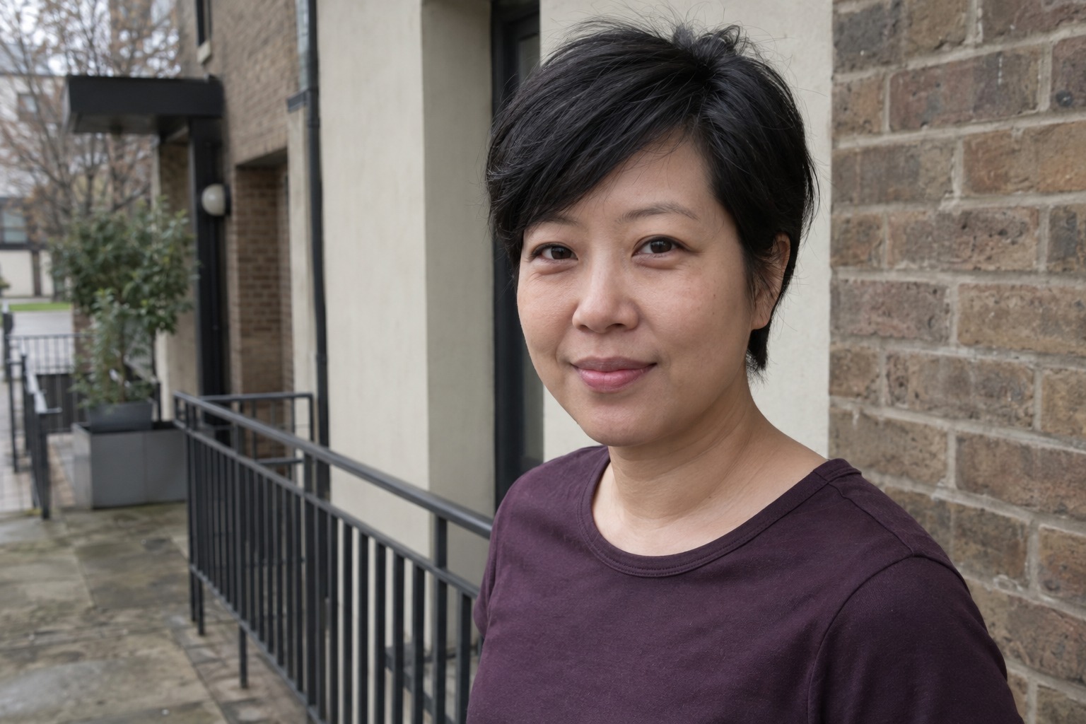
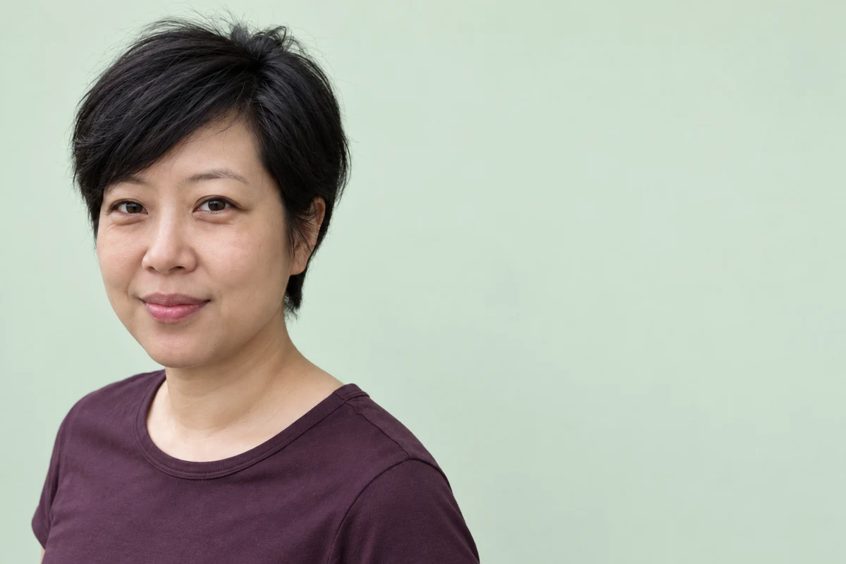
Fictional example. The walkway photo was edited into a 3:2 backdrop with the person on the left and pale mint space on the right. The real heading is long:
Heading:  Better questions, clearer work: what AI changed in our client reviews
Speaker:  Priya Anand, Head of Client Services
Crops: 3:2 web banner · 16:9 slide · square social tile- 3:2 works, just. The pixie cut, smile and aubergine top are kept, and the right side is clear. But headroom is tight — the hair nearly touches the top edge — and the lower shoulder reaches towards the text area, so the heading needs a left margin.
- The failure. In the square tile, the right-hand space mostly disappears and the two-line heading would run across the face. The 16:9 crop trims the top of the hair.
- The repair. For the square tile, the team put the heading in a separate panel below the portrait instead of on it. For the slide, they used the composition prompt above with “16:9” and “left”, since cropping the 3:2 file can’t add hair that isn’t there.
Try it
Brief for the layout you will actually use
Put your real heading on the edited backdrop and try it in each crop before you approve the image.
The AI skill: Specify a text-safe composition and check it with actual words rather than trusting a percentage in the prompt.
Loading the controls…
Illustrative event
Better questions, clearer work: what AI changed in our client reviews
Broad quiet space on the right. Headroom is tight and the lower shoulder reaches towards the text area, so try your real heading with a left margin.
Test the actual title at the actual size. The preview does not automatically grade text clearance or approve likeness.
Your instruction preview
Edit my permitted original for a 3:2 speaker layout. Preserve the source person, expression, hair, clothing and photographed body coverage. Keep full hair with modest headroom. Place the person on the left and leave a quiet text region on the right for the editable heading "Better questions, clearer work: what AI changed in our client reviews", which I will add in my layout editor. Generate no words, logos or invented hands. Make one candidate. I will test that actual heading and crop in the real layout; if the face and text cannot both fit, use a separate text panel or request a new composition from the original instead of squeezing or changing the person.Try it on your work: Use your real heading and destination size. Say where the person and the clear space must sit, keep the words editable, and check every crop yourself.
Go deeper
Make one composition per destination
Keep the approved photo as the source and ask for a separate composition for each real destination. A good landscape edit doesn’t approve the square version, so check each export on its own.
Check the picture and words as one accessible unit
Keep essential event information as real text, give the portrait a suitable text alternative, and use your page or slide editor’s contrast check. A textured photo backdrop needs a visual check along the whole heading, because one sampled colour can’t tell you the contrast everywhere.
Use the same brief for a product or chart
A product photo or chart can also need room for a heading. Keep its facts as the reference, name the layout and add the words separately. Don’t change product shapes or chart numbers to make a title fit.