Create a leadership website portrait with useful layout space
The portrait looks lovely on its own, then the web designer drops the heading on it and it lands on someone's shoulder. Give the image editor the layout job first, then test where the words actually go.
What you'll make
a landscape portrait for a website header, with the person on one side, quiet space for a real editable heading and a plan for the mobile layout.
What you'll need
a recent photo of yourself, or of a colleague who has agreed, that your organisation lets you use in an image editor; the page’s size and the exact heading, name and role. ChatGPT and Gemini both edit an uploaded photo. To practise first, download the fictional source.
Example result.
1. Decide where the words will go
Before you touch the image, decide which side the person sits on, how much text the header needs and what happens on a phone. A profile works best looking towards the heading. A frontal portrait can use either side. Keep the person’s real gaze and pose rather than asking AI to turn them to suit the design.
Keep the words out of the image. An editable heading in your page builder or design file lets you fix a name, change a role or adapt to a narrow screen without regenerating the portrait, and it stays readable at every width.
Why this works: the image editor can only leave space where you’ve told it the text will be. Deciding that first turns “make it work for the website” into a brief it can follow.
What you should see: a one-line layout note, such as “person on the right, short heading top left, text below the image on mobile”.
2. Ask for more background, not more person
Attach the untouched original in ChatGPT or Gemini and ask for one candidate:
Edit my attached portrait for a landscape website header. Preserve the
face, expression, head angle, gaze, hair, glasses, clothes and posture.
Use soft, readable neutral light. Place the head and upper shoulders on
the [side], with complete hair and headroom. Leave quiet [background]
on the [other side] for real page text. The extra width is background
only: no new arms, hands, pose or outfit. No words or logos. Make one
candidate.
[side] and [other side] come from your layout note. [background] is a plain setting, such as pale stone.
If you’d rather extend the frame yourself, design apps have expand tools. In Photoshop, drag the Crop tool’s edges outward and choose Generative Expand. In Canva, select the photo and choose Edit › Tools › See all › Magic Expand. Canva warns that photos with faces can expand poorly, so check the edges closely.
Why this works: a wider frame can be filled with background. Saying “background only” stops the editor from widening the frame by inventing a bigger body.
What you should see: the same person, moved to one side, with quieter space filling the rest. If the result has a new, wider torso or hands, reject it however good it looks.
3. Put the real heading on the candidate
Open the result in your page builder or design app and place the real heading, name and role as editable text. Check that the text clears the face and hair and reads against the background. Then preview the narrow mobile view: does the text drop below the image, or does the crop cut into the face?
Why this works: a frame can look balanced with no text on it. The real words, at the real size, show whether the quiet area is big enough.
What you should see: a heading that sits in clear space on desktop and a mobile layout where the face stays whole.
Check the result
- The face, glasses, hair and clothes match the original at full size.
- The body stops where the original photo stops; no new arms or hands.
- Your real heading fits the quiet area without touching the face, hair or shoulder.
- On a phone, the text sits below the image or the crop keeps the face whole.
The usual failure: the brief asked for a fully clear side, and the edit didn’t quite deliver it. Part of the person, usually a shoulder, reaches into the text area. It’s easy to miss with no text on the image and obvious once a two-line heading lands on it. Either use a shorter heading in the space that is clear, or repair the composition:
The appearance and light in this candidate are useful, but the
[body part] overlaps [text area]. Use my original for the person and
pose. Move the person to leave that area clear, adding background only.
Keep the full hair and the original clothes. No new body, changed face
or words.
[body part] is what’s in the way, such as “left shoulder”. [text area] is where the words need to go, such as “the lower-left third”.
Worked example: a profile portrait becomes a website header
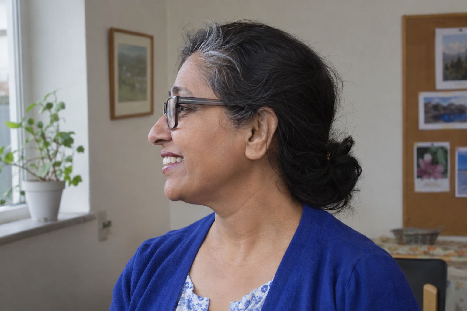
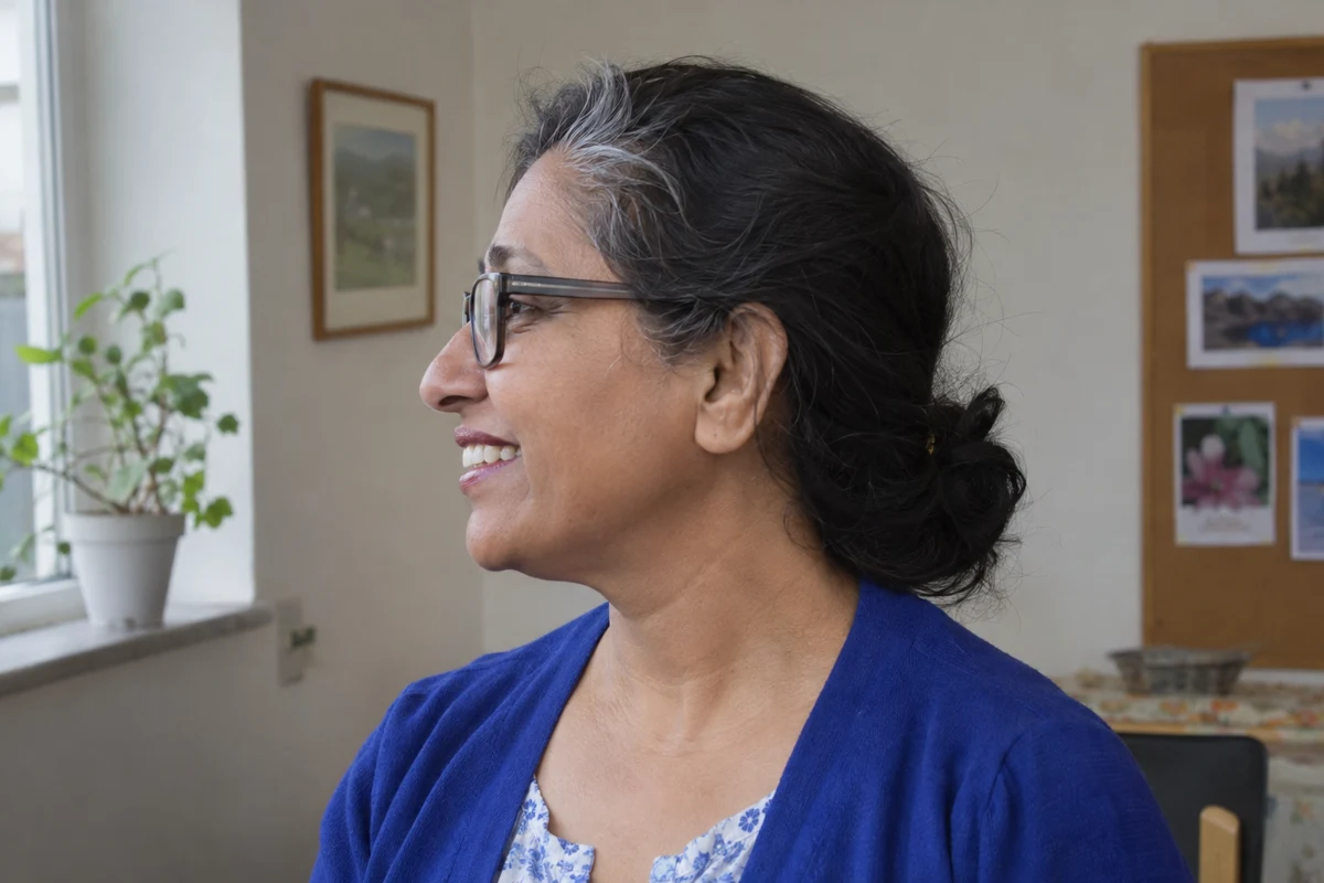
Fictional example. The source photo at the top is a left-facing profile in a busy community room, wearing glasses, a cobalt cardigan and a floral blouse. The brief was the step 2 prompt, with the person on the right and pale stone on the left.
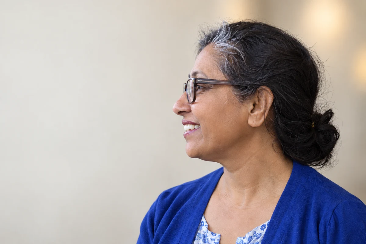
- What held. The light is softer, the room has gone and the cardigan, blouse, glasses and tied hair all match the original. The profile looks into the space where the heading will go.
- The failure. The brief asked for a clear left side, but the shoulder reaches into the lower left. “Meet the leadership team” fits in the dashed area. A two-line heading with an introduction runs onto the cardigan.
- The repair. For this page, the heading stays short in the upper left and the introduction moves below the image, which also works as the mobile layout. If the page needs longer text over the image, the repair prompt with “left shoulder” and “the lower-left third” is the next request. Don’t describe the whole left side as empty just because the prompt asked for it.
Try it
Place text where the photo has room
Separate negative space from invented person coverage.
The image did not deliver a fully clear left column. Use the quiet upper-left region for a short heading or place text below on narrow screens.
The example in text
- Left-facing profile on right
- Quiet upper-left space
- Shoulder enters lower-left
Task kit for this job: Download (ZIP) · Reusable instructions
Go deeper
Build a labelled mock-up for review
When someone else has to approve the layout, show it to them in a page, not as a loose image. Claude’s artifacts, ChatGPT’s canvas and Gemini’s Canvas can all build a simple HTML page from your image and text. HTML shows how the layout responds to width and keeps the text editable; a flattened screenshot is fine for discussion but can’t show either.
Build a simple HTML mock-up of a website header using my attached image
unchanged and this heading: [heading]. Show a desktop layout and a
narrow mobile layout. Keep the text as editable HTML, not part of the
image. Put a visible "Concept" label at the top. Explain how the image
is cropped at each width and whether any text overlaps the person.
A concept approval isn’t a live page. Build and check the real change in your website separately.
Use a separate crop for small places
A wide header and a small team-page card can share one master image, but they rarely suit the same crop. Make an ordinary crop for each place rather than generating a new person for each size. The profile circle guide shows how to check the smallest version.
Test with the longest real text
Placeholder text hides the long name and the two-line job title. Before anyone signs off, put in the longest real heading, name and role the page will show. The generated room is a backdrop, not evidence of a real office, so keep names and roles factual and get the person’s approval for a real use.