Turn a portrait into a careful pencil illustration
A pencil or watercolour portrait can make a speaker page or newsletter feel less corporate. It should change the medium, not quietly give the person a new haircut.
What you'll make
a pencil-style illustration that still shows the person’s glasses, hair, expression and clothes, plus a narrow next request if one detail drifts.
What you'll need
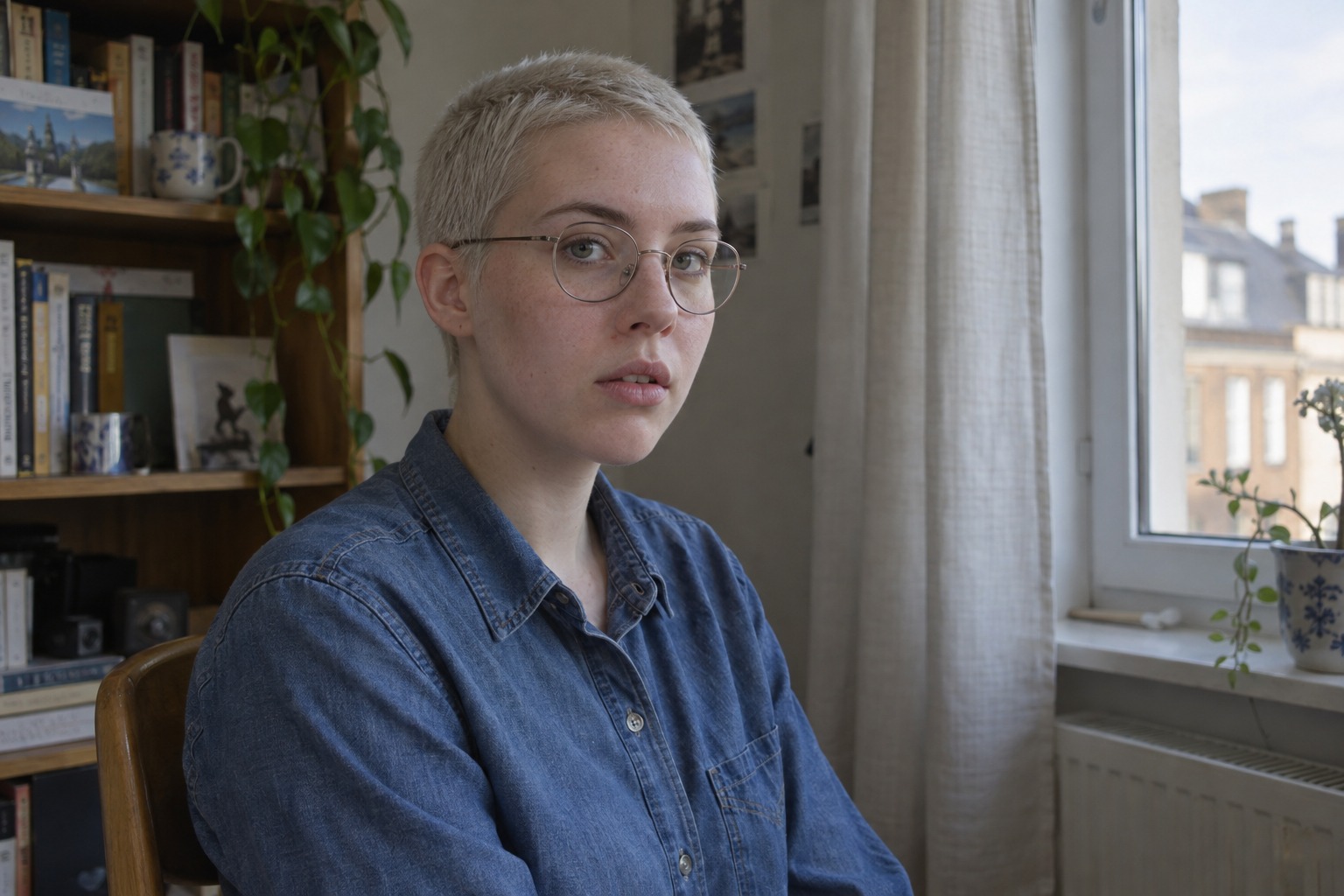
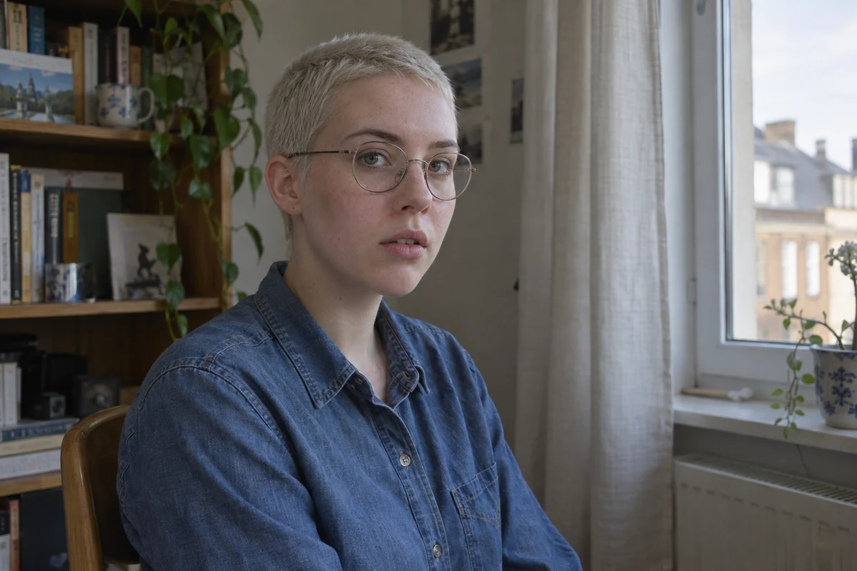
a clear photo of yourself, or of an adult who has agreed, that your organisation lets you use in its image editor (ChatGPT and Gemini both edit attached photos), and the size it will appear at. Keep the original. To practise first, use the fictional window-side photo.
Example result.
1. Name the medium and the features that must survive
Pencil cues are visible graphite line work, light shading and cross-hatching: overlapping strokes that suggest tone. You can ask for those without naming an artist or requesting a signature.
Then pick two or three defining features from your own photo — glasses, a hair silhouette, a distinctive neckline. Don’t carry this example’s glasses into a request for someone who doesn’t wear them.
Why this works: pencil strokes may reinterpret hair texture, but a new hairstyle or a missing lens is a different change. Naming the features gives you something specific to compare.
What you should see: a short list, such as “round glasses, short buzz cut, denim collar”.
2. Request a restrained drawing
Attach the untouched photo in your image editor and adapt this request:
Turn my original photo into a graphite pencil-style illustration
for [intended use]. Keep the source facial proportions, apparent age,
expression, hair silhouette, glasses and clothing structure recognisable.

Use delicate visible line work and restrained cross-hatching on
quiet ivory paper. Keep the eyes and mouth readable; avoid turning
skin texture into heavy etched lines. Preserve [defining source feature].

Keep complete hair with headroom in [destination frame], using only
photographed head-and-shoulder coverage. No new pose, hands, clothing,
signature, words or logo. Make one illustration for comparison.
[intended use] is where it will appear. [defining source feature] comes from your list in step 1. [destination frame] is the final shape, such as “a square profile crop”.
Why this works: the medium words say how to draw; the source facts say what the drawing must show. “A beautiful pencil portrait” leaves the model to decide both.
What you should see: one drawing with visible strokes, readable eyes and the features you named.
3. Compare features before adding detail
Put the drawing next to the original. Do both lenses and the bridge still make sense? Is the hair silhouette the same shape? Did hatching turn into a new neckline or deeper wrinkles? Then shrink it to the size it will be used: dense line work can turn eyes and glasses into one dark patch.
If one feature changed, name it and fix only that:
The drawing has [specific changed or obscured feature].
Use the untouched photo as the feature and expression reference.
Keep the useful pencil medium and composition. Correct only that
feature or its local shading; do not redesign the face, change
clothing or add detail to hide the problem. I will compare again.
[specific changed or obscured feature] is what you saw, such as “a left lens that merges into the frame”.
Why this works: “more detail” rarely restores a missing feature. A named feature and the original as reference give the editor one job.
What you should see: the same drawing with that feature corrected and nothing else redesigned.
Check the result
- The face, expression and apparent age match the original.
- Glasses, hair silhouette and neckline are the ones in the photo.
- Eyes and mouth stay readable at the final display size.
- The whole head fits the destination frame with some space above the hair.
The usual failure: the crop runs tight to the top of the head. It looks fine at full size, then the profile circle or banner clips the hair, and a vague “zoom out” invites the model to redraw the hairstyle to fill the space. Check the top margin against your final frame, then ask for space around the hair that already exists:
The drawing crops too close to the top of the hair for [destination frame].
Use my untouched photo as the person and hair reference. Keep the
pencil medium, line weight and expression. Add plain paper space above
and around the existing head and shoulders. Do not lengthen, restyle
or redraw the hair, and do not change the face.
If you can’t tell whether the drawing still looks like the person, go back to the photo with a smaller interpretation. A drawing can be attractive and still miss the reference.
Worked example: graphite with a tight top edge
Fictional example. The photo has a three-quarter face, a short blond buzz cut, round wire glasses, a slightly parted mouth and a denim shirt. The brief used the step 2 request with “round glasses” as the defining feature.
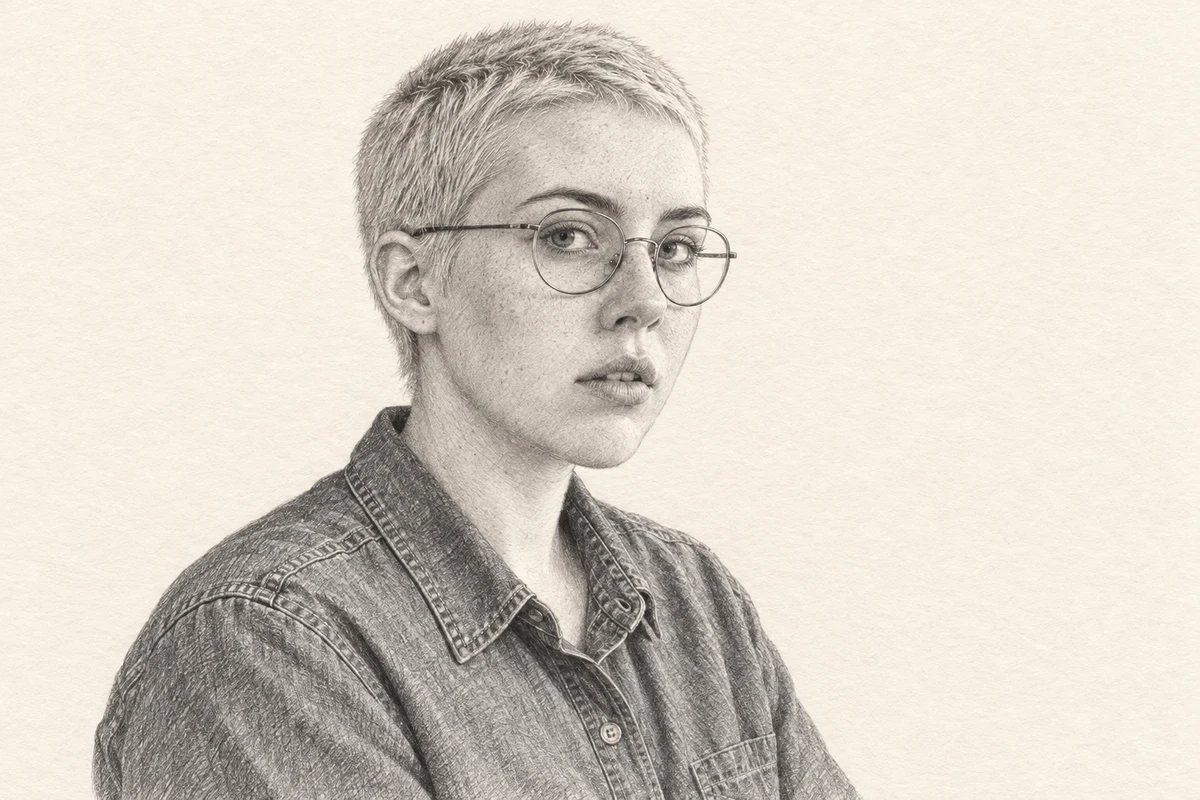
- What held. The drawing has visible graphite lines and hatching, readable eyes and two coherent round lenses with a bridge. The short-hair silhouette, parted mouth and denim collar and buttons are recognisable.
- The failure. The head is complete, but the upper margin is narrow. For a square profile crop the hair would touch the edge. That’s the moment to use the crop repair above, naming “a square profile crop”, rather than asking the editor to make the portrait smaller.
- What still needs a look. Skin and cloth are more heavily textured than the photo, and freckles are reinterpreted as strokes. The medium doesn’t preserve every feature exactly, so check the result with the person before it goes on a page.
Try it
Tell the drawing which facts to retain
Connect source glasses, hair and garment structure to the drawing medium and a specific next review request.
The AI skill: Separate an illustration’s line/shading treatment from source features that should remain recognisable.
Loading the controls…
Source authority
The source has two round wire spectacle lenses, a narrow bridge and readable eyes.
Medium can change
Graphite shading and line weight may change; adding or merging a lens is a different change.
Both lenses and eyes remain readable in this actual drawing. Compare the frame shape with the source before accepting the interpretation.
Choose a feature to connect its visible source facts with the next AI review request. No new illustration or likeness score is generated.
Your instruction preview
Inspect the glasses in my permitted source and pencil-style candidate. Compare the two lenses, bridge, rims and readable eyes. Name any visible change before suggesting a repair. Keep the source spectacles and face as the authority; simplify line weight or shading only if needed, without adding or merging a lens.Try it on your work: Swap these example features for the defining features in your own photo. Say what the medium may change and what must stay, then compare the drawing with the original before asking for one narrow repair.
Go deeper
Softer medium: watercolour
Watercolour cues are translucent washes, soft pigment edges and visible paper. “Make everything dreamy” is the request that blurs an eye. Say where softness belongs instead: let the background and shoulders carry the washes, and keep firmer readable edges around the eyes, nose and mouth. If a wash still swallows a feature, repair that one edge:
The wash around [specific feature] makes it less readable.
Use my untouched source as the feature and expression reference.
Keep the useful watercolour medium, surrounding palette and crop.
Restore enough definition around that feature without inventing
a new face, heavy outline or different garment. I will compare again.
Use less hatching for a small avatar
Preview the real small crop before asking for stronger lines. If eyes or glasses merge into a dark patch, ask for less local shading while keeping the feature shapes. Keep the full-size original beside the small preview when you compare.
Compare a bolder graphic treatment
The duotone guide uses bold tonal shapes instead of strokes, and explains when you need a vector file rather than a raster image. If you attach a style example, say it is for the medium only, so the model doesn’t borrow its face or clothes.