Create a recognisable duotone portrait for a personal brand
You want a bold teal-and-lime portrait for your website, not another grey headshot. Strong contrast is the point — as long as it doesn't erase the eyes or hand you a new jaw.
What you'll make
a duotone-style graphic portrait that still looks like the person, framed with room above the hair.
What you'll need
a recent photo of yourself, or of an adult who has agreed, an image editor your organisation lets you use (ChatGPT and Gemini both edit attached photos), two colours and the shape it will be shown in. Keep the original. To practise, use the fictional living-room photo.

Example result.

1. Decide whether duotone suits the use
Duotone here means a graphic built around two main colour families, one for the dark shapes and one for the highlights and background. It suits a personal website, a talk page or a campaign graphic. For a staff directory or anything that needs a current likeness, use a checked photograph instead.
Pick the two colours and decide which does which. Note the features that make the person recognisable — hair outline, glasses, expression, the angle of the shoulders — because those are what you’ll check.
Why this works: you’re deliberately changing colour and texture. Writing down what must stay the same is what stops “deliberate” spreading to the face.
What you should see: two colours with a role each, and a short list of features to keep.
2. Ask for a graphic with readable features
Attach the original photo and ask for one illustration:
Turn my attached photo into a duotone-style illustration for [use].
Keep the facial proportions, apparent age, expression, hair outline,
glasses and clothing shape recognisable, and keep the head angle,
gaze and shoulder posture from the photo.

Use [dark colour] for dark tonal shapes and [light colour] for
highlights and a quiet background. Keep both eyes, the mouth and
the edges of the face readable; use a few in-between tones if needed.

Keep the complete hair with clear space above it in [frame].
No new pose, hands, clothes, words or logos. Make one illustration.
[use] is where it will appear. [dark colour] and [light colour] are your two colours, such as “deep teal” and “pale warm lime”. [frame] is the shape, such as “a square crop”.
Why this works: colour roles give the contrast a job, and naming the eyes and mouth gives you something to check. “Bold branding” on its own tends to produce solid dark areas that swallow the person.
What you should see: one graphic that reads as the same person at a glance, in your two colours.
3. Check the features, then the frame
Compare face shape, hair, expression, glasses and neckline with the original, at full size and at the size it will be shown. Are both eyes distinct? Has a dark mass merged the mouth into the cheek? Then check the frame: is the hair complete, with space above it?
If a dark shape has swallowed a feature, fix just that:
The [feature] is lost in a solid dark shape. Using my original
photo for the feature and expression, restore a readable edge
around it. Keep the palette, crop and illustration style, and
don't change the feature's shape or add new facial detail.
[feature] is what you can’t see, such as “left eye”.
Why this works: features and framing fail in different ways, and each needs its own narrow fix rather than a fresh start.
What you should see: a list of what’s right, and at most one thing to fix.
Check the result
- The person is recognisable at the size it will be shown.
- Both eyes and the mouth are readable.
- The expression, hair outline and shoulder angle match the photo.
- The whole hair is in frame, with space above it.
The usual failure: the style is right and the frame is wrong — hair touching the top edge, or a bun cropped off — and the tempting fix is to ask for a whole new style. That throws away the good graphic and adds new changes to the face. Fix the frame instead, giving each image a job:
Use my untouched photo as the person reference and this illustration
as the style reference. Widen only the framing so the complete hair
has a clear band of background above it. Keep the expression, gaze,
shoulder posture, clothes and palette. Don't redraw the face.
Worked example: the bun that touched the ceiling
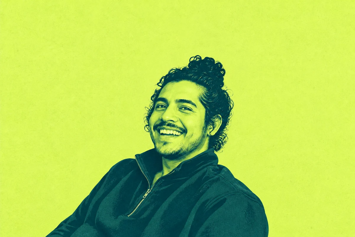
Fictional example. The photo at the top shows a broad laugh, tied curls and relaxed, turned shoulders. The brief asked for deep teal and pale lime in a balanced head-and-shoulders frame.
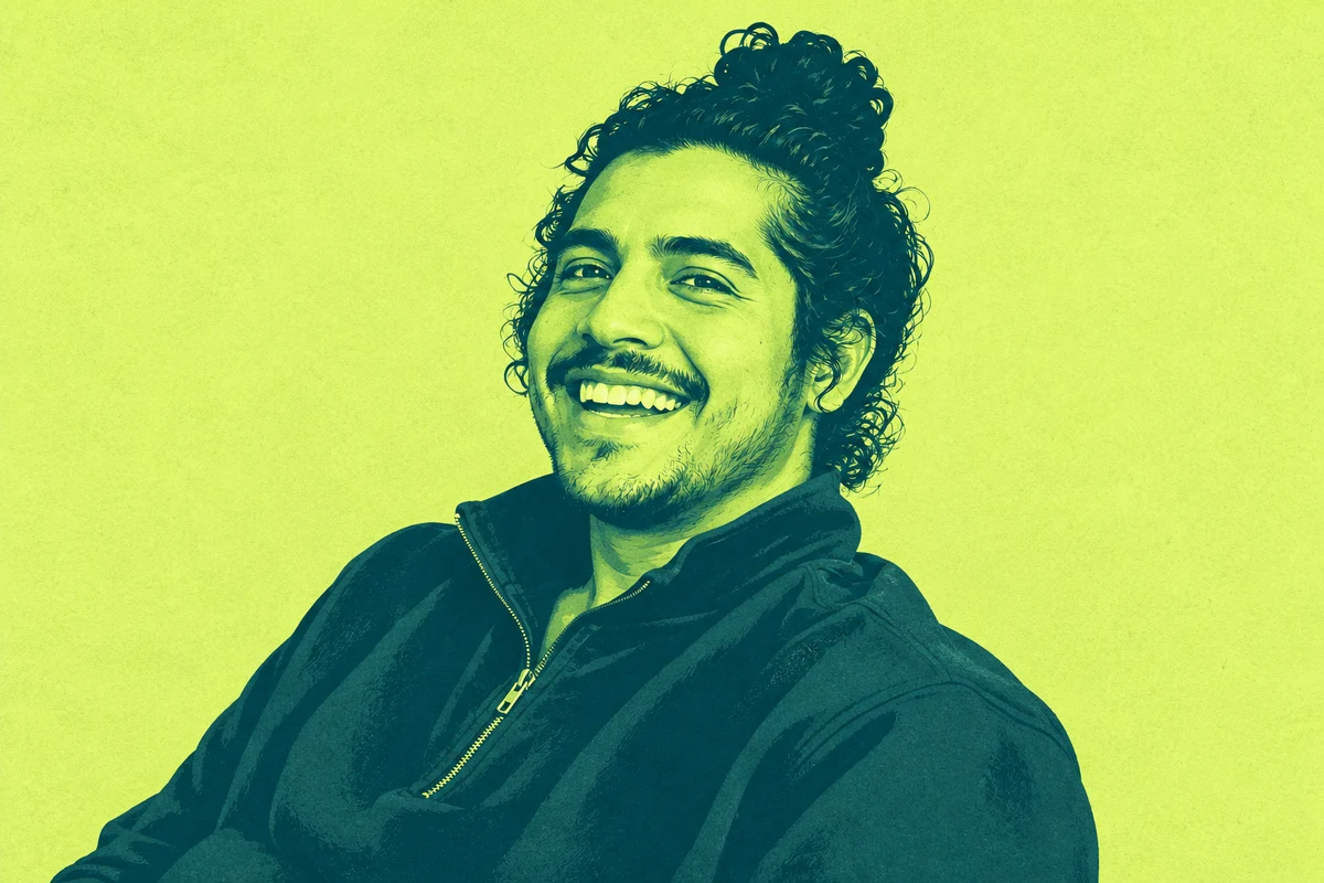
- The failure. The first graphic kept the laugh, the curls and the sweatshirt, but the top of the bun sits almost on the top edge. The headroom instruction was missed.
- The repair. The framing repair above, with the photo as the person reference and the graphic as the style reference, made the portrait smaller with a broad lime band above the bun, as in the after image at the top. It overshot: the band is about a quarter of the canvas, more than needed, but easy to crop.
- What still needs a look. The laugh and posture survived, but the mouth and hair are drawn slightly differently. Compare them with the photo before using it; the person should be the one to approve it.
Try it
Keep the good graphic; fix the frame
Compare the first cramped graphic with its framing repair, then see why a new style wouldn't have fixed it.
The AI skill: Separate a composition correction from a new style or face request.
Loading the controls…
The laugh, tied curls and turned shoulders came through. The top of the bun nearly touches the edge, so the frame is the only thing to fix.
Choose the next instruction to inspect
The headroom is the fault, so the fix names only the frame and gives each image a job: the photo for the person, the graphic for the style.
The next request
Try it on your work: Look at your own illustration for one visible fault. Fix that one thing, and keep the photo as the reference for the person.
Go deeper
Don't call a vector-looking image an editable vector
An image editor gives you a PNG or WebP made of pixels. A clean graphic outline doesn’t make it an SVG with shapes a designer can edit. If you need a vector, ask for the style here, then have a designer trace or rebuild it in a vector tool and check the exported file.
When exact colours matter
The model treats your colours as a reference, so the file will contain many in-between shades. If the job needs an exact two-colour file or print separation, convert it in an editor with a palette control, or ask the designer or printer, and check the exported file.