Try film-inspired grain without changing the person
You like the portrait; you'd just like it to look a little less like a phone photo. Asking an image generator for grain can hand back a warmer, sharper, slightly different face, with grain you can barely see.
What you'll make
a portrait with subtle film-inspired grain and the same face, or, if the photo also needs a new background, an edit you’ve checked before adding grain.
What you'll need
a recent photo of yourself, or of an adult who has agreed, that your organisation lets you edit; a photo editor with a grain or noise control (Lightroom’s Effects › Grain is one); and, only for the background route, an image editor that takes attached photos, such as ChatGPT or Gemini. Know the size the image will appear at. To practise first, use the fictional doorway photo.
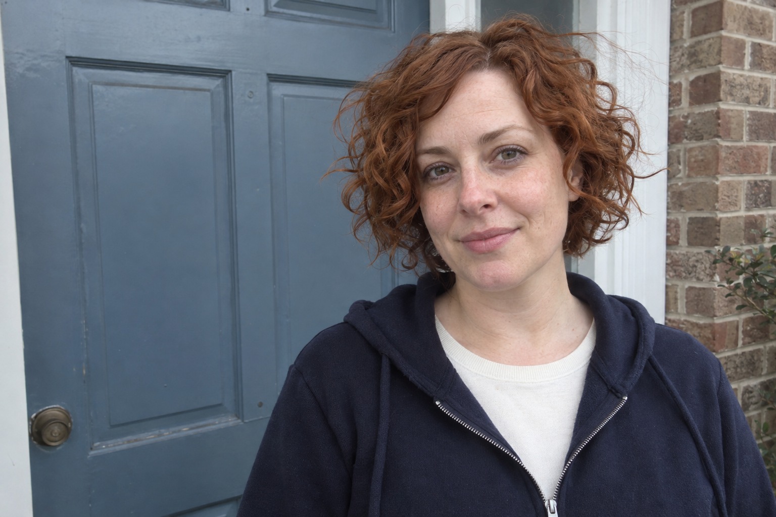
Example result.
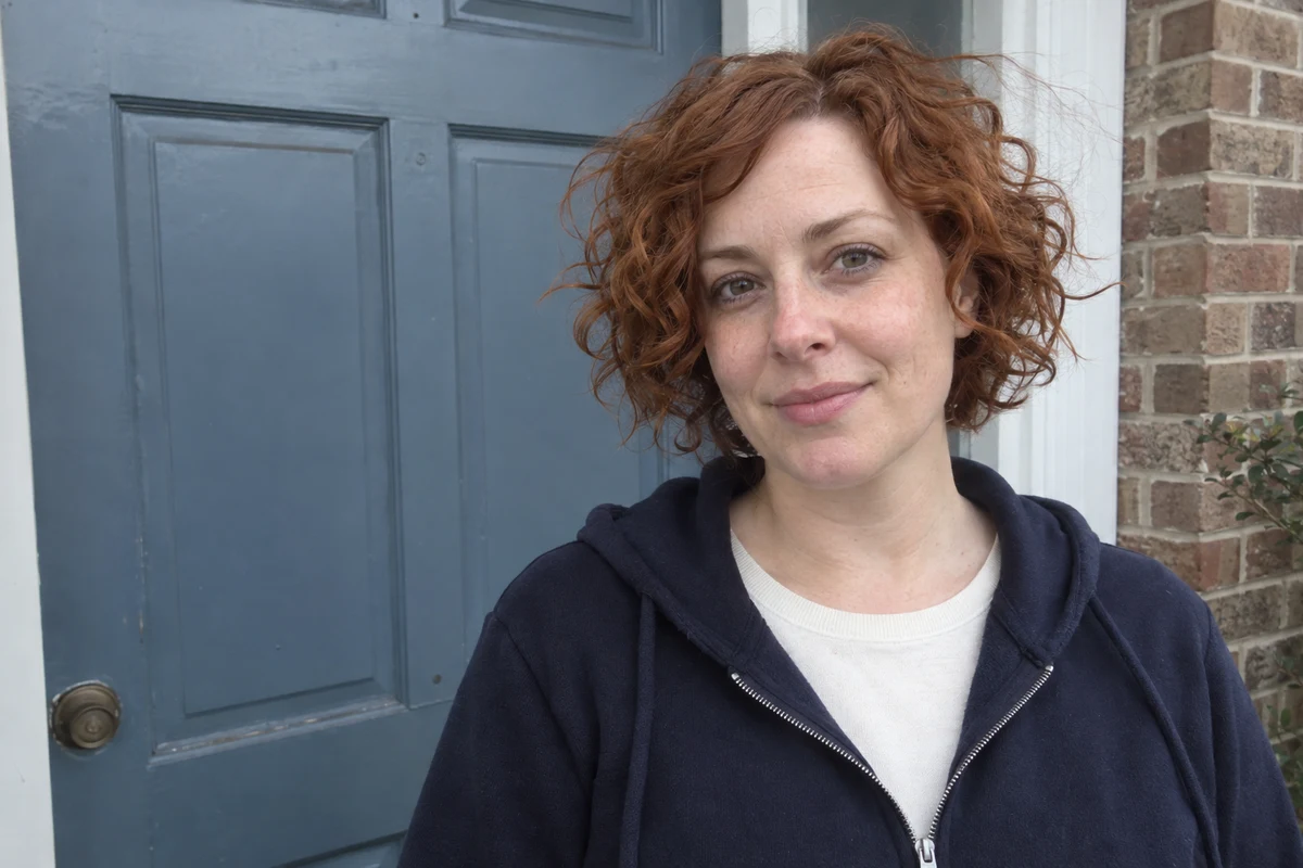
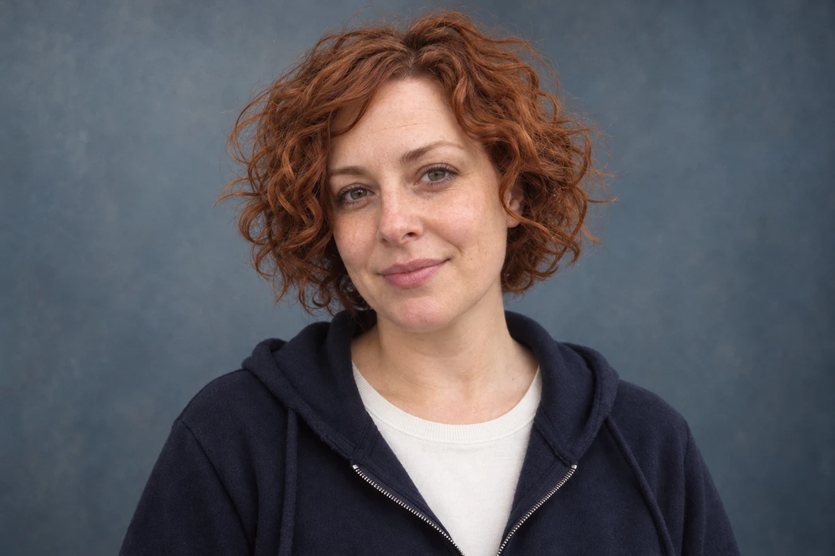
The grain in this edit is too subtle to see at this size. The bigger change is the warmer, brighter face, which is the point of this guide.
1. Decide whether texture is the whole job
Grain is fine, irregular texture across the whole image. “Film-inspired” here describes a look, not a claim about a camera or film stock.
| What you have | What to do |
|---|---|
| A portrait you’re happy with, wanting texture | Add grain in your own editor (step 2) |
| An informal photo that also needs a better background or framing | Edit first, check it, then add grain (step 3) |
| A wish for more freckles, lines or rougher skin | That changes the person, not the image texture; rethink the brief |
Why this works: an image generator redraws the picture even when you ask it to “only add grain”. A grain slider changes the texture and nothing else.
What you should see: one row chosen. Most readers with a decent photo will stop at step 2.
2. Add grain in your own editor
In Lightroom, open the photo, go to Edit › Effects and use the Grain sliders: Amount for how much, Size for how coarse, Roughness for how even. Lightroom keeps the original, so you can reset. Other editors call it grain, noise or film texture. If you’re not sure where yours keeps it, ask your AI assistant:
My portrait is already finished. I only want subtle film-inspired
grain. I use [editor and version]. Explain a reversible way to add
grain in that editor that leaves the person unchanged. If you aren't
sure a control exists in my version, say so rather than guessing.
Tell me what to compare at full size and at [final display size].
[editor and version] is the software you have, such as “Photoshop on Windows”. [final display size] is how big it will appear, such as “a 200-pixel profile circle”.
Why this works: it asks AI for directions in software you control, rather than a new picture of the person. The “say so rather than guessing” line matters, because assistants are confident about menus that moved two versions ago.
What you should see: a few steps that match the menus on your screen, and grain that’s visible at full size without hiding the eyes.
3. If you also need a new background, edit first and add grain last
When the original needs a quieter backdrop or better framing, use an image editor for that, and leave the grain out of the request so you can judge the person on their own:
Edit my attached original for [intended portrait use].
Preserve the face, apparent age, expression, hair, natural
skin detail, clothes and accessories. Keep the face light
neutral and its colour matched to the original.
Improve [one visible framing or background issue] and use
a quiet [background colour] background. Add no grain, texture,
borders, dates or camera logos. Make one candidate.
[intended portrait use] might be “speaker page”. [one visible framing or background issue] is the main problem, such as “a busy doorway”. [background colour] might be “muted blue-grey”.
Once the person checks out, add the grain in step 2.
Why this works: grain and a changed face are hard to tell apart in one step. Splitting the jobs means each check has one question.
What you should see: a cleaner background around the same person, with no added texture yet.
Check the result
- The eyes, expression, face shape, hair and clothes match the original.
- Freckles and skin detail are the ones in the original: no new lines, sharper pores or older look.
- The face isn’t warmer or brighter than the original.
- At the final display size, the grain is visible but the eyes are still clear.
The usual failure: you ask a generator for “film-inspired” and it changes the person instead. The face comes back warmer, brighter and more finely detailed, while the grain is so faint it vanishes on a phone. It looks like a nicer photo, which is why it passes a quick glance. Compare the cheeks and hair with the original before you look at the texture. To keep the useful background but get the face back:
Restart from my untouched original. Keep the framing and
quiet background from the candidate, but match the face's
colour, brightness and skin detail to the original exactly.
Add no grain or texture; I will add it separately.
If the face still drifts, keep the original and only add grain in your editor. A calmer backdrop can’t repair a new expression.
Worked example: copper curls and a faded door
Fictional example. The original has a readable face, copper curls, a navy hoodie with an ivory neckline, casual right-side framing and a faded blue door behind. The edit asked for balanced framing, a muted blue-grey background, gentle contrast and fine grain, all in one request.
- What worked. The framing is more balanced and the doorway has gone. The curls, hoodie and neckline stay, with coherent shoulders and no invented hands.
- The failure. The face and hair are warmer and brighter, with stronger fine detail than the camera recorded. The grain shows only as faint background texture, invisible at the size above. The request got a different-looking person and almost none of the effect it was for.
- The repair. Use the repair prompt to keep the background and framing while matching the face to the original, with no grain. Then add grain in an editor and judge it at the final size.
Go deeper
Give a team set the same grain
If a whole team’s portraits need the same look, don’t generate each one. Make one grain setting, save it as a preset in your editor and apply it to every photo. Each person stays as photographed, and the set matches because the texture is identical rather than reinterpreted.
Change colour, contrast and texture one at a time
A warmer face, darker shadows and fine grain are three separate observations. Change one, check it, then move to the next. When a background colour has spread onto the person, the brand-colour portrait guide shows how to scope it.
Use an illustration when that's the intended medium
A pencil drawing or duotone graphic changes the medium on purpose. Name it as an illustration rather than presenting it as a camera portrait. The duotone guide separates a graphic treatment from recognisable features.