Use a brand colour behind a portrait without tinting the person
Marketing wants the team photos on the brand teal by Friday. The edit comes back looking right, until you notice the face has gone slightly warmer and the background isn't quite your hex.
What you'll make
a portrait on your brand colour with the person’s own skin and clothes, plus a quick decision on whether you need a colour treatment or an exact flat fill.
What you'll need
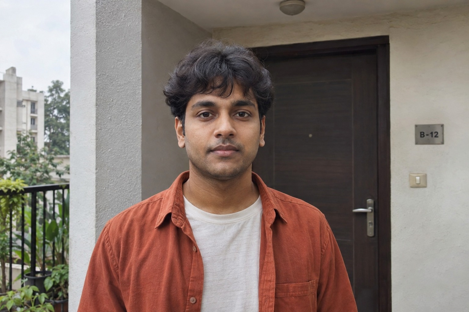
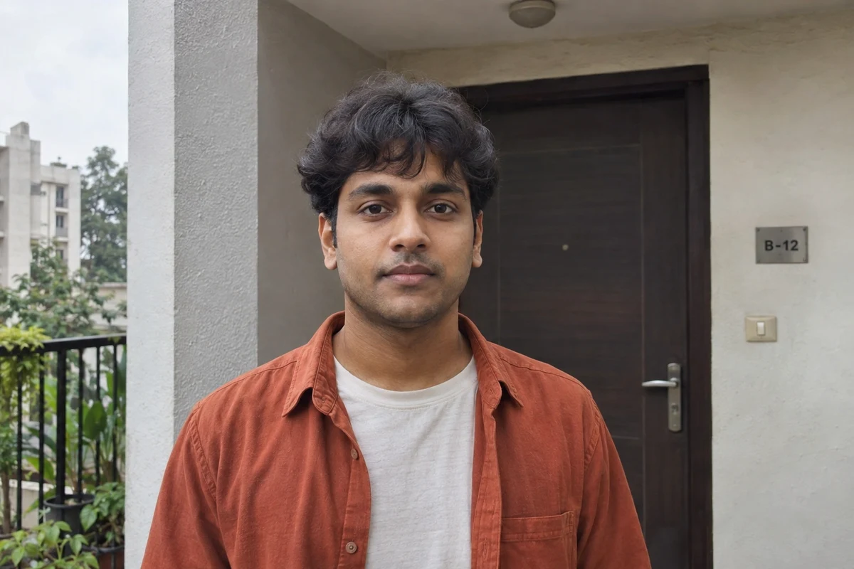
a recent photo of yourself, or of an adult who has agreed, that your organisation lets you use in its image editor (ChatGPT and Gemini both edit attached photos), and your brand colour’s hex code. Keep the untouched original. To practise first, use the fictional doorway photo.
Example result.

1. Decide whether you need a treatment or an exact colour
“Use our teal” is fine for a creative treatment. A hex code is more specific, but giving one to an image generator doesn’t make every background pixel that value. Shading, falloff and generated variation stay in. A pleasing shade and an exact value are different jobs, and repeated generation is a poor way to set a colour.
| Your use | Route | What to check |
|---|---|---|
| Portrait with a teal studio feel | A scoped image edit | Person, colour cast, crop |
| Exact brand field behind a badge | A checked cut-out, then a fill you set | Edges and the fill value |
| Website panel around a portrait | Set the panel colour in the page | Layout and contrast; leave the photo alone |
Why this works: most “the colour’s wrong” arguments are really about which of these three jobs you had.
What you should see: one row chosen. If it’s the second or third, the creative edit isn’t the step that sets your colour.
2. Give the colour one job
Attach the untouched original in your image editor. If you add a swatch image, say it’s a background reference only. The person in the photo decides what the person looks like.
Edit my attached original for [intended portrait use].
Use [colour name and hex code] for the BACKGROUND ONLY,
with [a gentle studio falloff / a quiet flat-looking treatment].

The untouched original supplies the person and clothing.
Preserve the face, apparent age, expression, hair, natural
skin appearance, clothes and accessories. Keep readable
neutral light on the face. Do not apply the background
colour as a cast on the person.

Improve [one visible framing or lighting issue].
Keep the complete hair and room for the intended crop.
Make one candidate.
[intended portrait use] is where it will appear, such as a staff page. [colour name and hex code] is your brand colour, for example “deep teal, #0B5B57”. Choose one of the two background styles. [one visible framing or lighting issue] is the single thing the original gets wrong, such as a busy doorway.
Why this works: “make everything on brand” leaves skin, clothes and surroundings open to reinterpretation. Naming the region gives you something you can check.
What you should see: one candidate with the colour behind the person and nowhere else, at least at first glance.
3. Read the background colour yourself
You can’t judge a hex value by eye, and the image won’t tell you. Use a colour picker:
- PowerPoint: insert the image, select any shape, open Shape Fill › Eyedropper and click a background corner. Shape Fill › More Fill Colors then shows the values.
- Mac: open Applications › Utilities › Digital Color Meter, set View › Display Values to hexadecimal and hover over a corner.
Check two opposite corners and compare them with your brand hex. If they differ and your use needs an exact field, take the colour out of the image brief: use a checked cut-out and set the fill in your slide or layout editor.
Why this works: it turns “looks about right” into two numbers you can compare with the brand guide.
What you should see: two hex values close to yours for a treatment, or a decision to switch to the cut-out route.
Check the result
- Put the original and the candidate side by side on the same screen. Is the face warmer, cooler or brighter?
- Did grey hair pick up a highlight, or the shirt drift towards the background colour?
- Do the eyes, jaw, hairline and expression match the original? A good colour treatment doesn’t settle likeness.
- Does the background look right in the real layout, not only at full size?
The usual failure: the background colour leaks onto the person. The face goes a little warmer or greener, or a pale shirt takes on the backdrop’s hue. It’s easy to miss because the whole image looks coherent; compare the cheeks and collar with the original, not with the background. Name the area and ask for that alone:
The background is useful, but [specific area] appears
[warmer / cooler / closer to the background colour] than my original.
Use the untouched original as the reference for the person's colour
and appearance. Keep the background and framing. Correct only that
cast without smoothing skin, reshaping the face or changing clothes.
If the face changes more with each correction, go back to the original. A plain cut-out on a fill you set may be the smaller job.
Worked example: a doorway photo on brand teal
Fictional example. The doorway photo has a level head, square shoulders and a neutral closed mouth. Those are facts to keep, not faults to turn into a smile. The brief used deep teal, #0B5B57 with a gentle studio falloff and asked to lose the doorway.
- What worked. The doorway and its door plaque are gone, the head stays level and the rust overshirt and off-white T-shirt keep their colours. The hair is complete, though there’s less room above it than a tight profile crop might want.
- The failure. The face looks slightly warmer than the original, and the hair and stubble are more defined than the camera recorded. That’s the cast the Check list asks you to look for, and it’s subtle enough to pass a quick glance.
- The repair and the colour check. The repair prompt, with
the face and neckandwarmer, is the right next step; then compare the cheeks with the original again. The colour picker showed the corners at #0D5458 (upper left) and #003F44 (lower right) against #0B5B57 requested. That’s a treatment, not an exact fill, so for a uniform badge background this one goes down the cut-out route.
Go deeper
Warm or neutral backgrounds without an orange face
Cream, stone and warm white raise the same problem in a different colour: you ask for a warm setting and get warm skin. Put the warmth in the setting and keep the face under neutral light. In one fictional balcony edit, the cream wall worked, but the skin went warmer and a blurred plant appeared despite the no-props request. Check glasses too: they need a coherent bridge, stems and lenses, not a lighting “improvement” that quietly removes them.
Edit my attached original into a warm editorial portrait for
[intended use]. Put the warmth in a quiet warm-cream background
and gentle atmosphere only. Keep the face under readable neutral
light, matching the original skin colour. Keep the glasses,
clothes and expression. Add no plants, props or furniture.
Use a checked transparent cut-out for an exact field
Keep background removal separate from portrait regeneration. Check hair, glasses and shoulders on both light and dark backgrounds, then set the fill in your editor. The cut-out portrait guide explains what to look for at the edges.
Don't let a swatch invent a wardrobe
If a campaign needs matching clothing, that’s a separate styling decision for the person in the photo to agree to. Don’t let a background reference make it quietly. Start from a photo that already has the intended clothes where you can, and check the whole candidate afterwards.