Build a moodboard with useful visual variables
The team liked image three. A week later, nobody can say whether it was the light, the background or the fact that it was the last one on the slide.
Example output
A three-direction moodboard
Three complete directions for a fictional project-planning page. Each one changes more than one thing. Choose a direction to see its image and request.
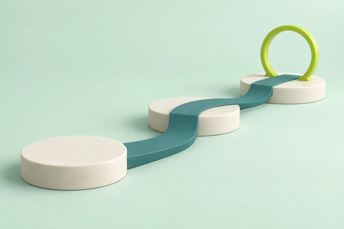
Calm ceramic · Broad even light · mint setting
No reference is needed for this fictional concept.
Download the Calm ceramic reference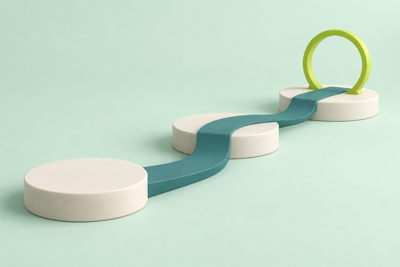
Read the prompt for this direction
Create one refined landscape 3:2 sculpted miniature visual for a fictional internal project-planning page. Subject: a single continuous deep-teal curved walkway joins three broad low ivory ceramic milestone platforms; the final platform has one upright lime circular hoop supported firmly at its base. Exactly three platforms and exactly one hoop. The walkway rests on the platforms and mint ground, with believable physical joins, no unsupported floating parts. Oblique three-quarter camera, whole scene centred with breathing room. A calm pale-mint studio setting, even broad diffused light, soft short contact shadows. Smooth matte ceramic, understated texture, ivory/teal/mint with a small lime accent. Clear silhouette and polished product-image quality. No people, hands, faces, filing cabinets, paper, documents, letters, numbers, logos, watermarks, arrows, labels or diagram text. This is direction A: calm and readable. One single image, not a collage, no surrounding frame, opaque background.What you'll make
A labelled moodboard of three visual directions for one image job, and a short brief for the direction you choose.
What you'll need
ChatGPT or Gemini with image generation, the message and placement for the image (for example, a web shop banner with the headline on the left), and any reference images you’re allowed to use. Allow about 30 minutes. Keep real logos and exact wording for your design file, not the image prompt.
1. State the job before the look
Write down what the image has to say and where it will sit. A banner with a headline needs quiet space on one side, and a poster can carry a busier scene. Without the job, AI returns four attractive images and leaves you to invent a reason for one afterwards.
Then pick the variables to vary (light direction, palette, material, composition, background) and mark what stays fixed: the subject and its facts. For a real product, the photo or specification is the authority.
Plan a small moodboard for [message, audience and placement].
Keep [subject and source facts] fixed. Propose three clearly different
directions, each with a labelled choice for light, palette, material
and composition. State what changes, what stays and why it serves the job.
Do not copy a reference's subject or invent factual claims. List exact
brand colours and final wording as separate requirements for the design file.
Return a short brief for each direction before generating any images.
[message, audience and placement] is what the image says, who sees it and where it goes. [subject and source facts] is what must stay true: shape, colour, count and proportions.
Why this works: With a job to serve, each direction has to argue for itself instead of simply looking different.
What you should see: Three short briefs, each naming its light, palette, material and composition, with the fixed subject repeated in all three.
2. Make direction A, then edit from it
Generate direction A from its brief in the same chat. For B and C, edit A rather than starting again, so the subject, camera and crop carry over.
| Tool | How to edit from an image |
|---|---|
| ChatGPT | Attach direction A in the message box, then paste the edit prompt. |
| Gemini | Upload direction A from your device, or pick it from Library in the sidebar, then type the edit prompt. Image editing isn’t available to users under 18, and work or school accounts may have other limits. |
Edit the attached image into direction [ID] from the moodboard brief.
Keep the subject, its proportions, the camera angle and the crop.
Change only the properties listed for direction [ID].
Add no new objects, people, text or logos.
If a change forces the subject to move, say what moved.
[ID] is the direction letter from the step 1 brief. If the tool redraws the whole scene instead of editing it, start a new chat, attach A again and put “Keep the layout of the attached image exactly” at the top of the prompt.
Why this works: Editing from one image keeps the parts you didn’t mean to change, so most differences are the ones you asked for.
What you should see: Three images of the same subject from the same angle, each with its own light, palette or material.
3. Caption every change
Attach all three images to one message and ask for captions naming every visible difference from A, not only the intended one. A moodboard shouldn’t need a presenter to remember which prompt made which picture.
Compare each attached image with direction A.
For each one, list every visible difference: light direction, shadow,
background, palette, material, composition and crop.
Mark which differences the brief asked for and which it did not.
Keep each caption under 30 words.
Name cues in words: “muted mint and teal palette with broad soft light” is more transferable than “like reference 3”. If a direction borrows from someone else’s image, the style reference guide explains what a reference can decide.
Why this works: Listing every difference catches the changes nobody asked for, and those are the ones that make a preference impossible to trace.
What you should see: One caption per image, with any unrequested change marked.
4. Turn the choice into a brief
Choose the direction that serves the job, then keep only the properties you want. Avoid combining every attractive element into a “minimal, detailed, dramatic, soft” brief that argues with itself.
A good selection note says: “Use the calm palette and readable composition; keep the subject source unchanged; exclude the dramatic shadow.”
Weak: “Combine all three and make it premium.”
Turn direction [ID] into a reusable image brief for this placement.
Keep [fixed facts]. Use [chosen light, palette, material and composition].
Exclude [unwanted cue].
Keep exact words and brand assets out of the generated artwork.
Make one image, then list the source and layout checks.
If the subject changes, say which fixed element moved.
[fixed facts] comes from step 1, [chosen light, palette, material and composition] from your chosen direction’s caption, and [unwanted cue] is what you liked least. The visual brief guide covers handing it to a team.
Why this works: The brief names visible properties, so the next person, or the next chat, can reproduce the look without the moodboard in front of them.
What you should see: A brief of a few lines, one new image and a short list of checks.
Check the result
- Each caption lists every difference you can see beside direction A.
- The subject keeps the source’s shape, count and proportions.
- The image fits its placement, with room for the headline.
- The final brief names properties (“warm light from the right”), not pictures (“like B”).
The usual failure: A direction changes two things and its label names one. The “side light” image also has a darker background, so when the team prefers it, nobody knows which they liked. You’ll spot it in the step 3 captions: more than one requested change means it’s a complete direction, not a test of one variable. Label it that way. When the decision hangs on one variable, make a pair that changes only that.
Direction [ID] changed both [first variable] and [second variable].
Edit the attached direction A again and change only [first variable].
Keep the background, palette, material, camera and crop exactly as they are.
Caption the result with the one change you made.
Worked example: a launch banner for a notebook
Fictional example. Brightwell, a small stationery shop, needs a 3:1 hero banner for the web page of its new linen-cover notebook. The headline will sit on the left third.
Job:   web shop hero banner, 3:1, headline on the left third
Fixed: sage-green linen notebook, closed, three-quarter view;
       the product photo is the source for colour and proportions
A  Calm daylight: soft even window light, oatmeal backdrop
B  Evening desk: warm lamp light from the right, dark walnut desk
C  Flat lay: top-down camera, pale grey card
The step 3 captions came back like this:
B  Light from the right, longer shadows (asked for). Walnut desk
   replaces the oatmeal backdrop (asked for). Left third now dark
   behind the headline area (not asked for).
C  Camera moved to top-down (asked for). Notebook reads thinner
   from above (not asked for).
The team preferred B “because the light gives it depth”. The repair prompt, with light direction as the first variable and the backdrop as the second, produced B2:
B2  Warm lamp light from the right, longer shadows. Oatmeal
    backdrop, camera and crop as in A.
Brightwell’s selection note: “Use B2: warm side light from the right on the oatmeal backdrop. Keep the product photo as the source. Exclude the walnut desk — it darkens the headline area.”
- The fixed line did the protecting. Naming the product photo as the source meant no direction could change the notebook’s colour or shape.
- The captions caught the second change. Without them, the walnut desk would have arrived in the final brief as part of a light the team liked.
- C stayed a complete direction. Nobody was choosing between its parts, so it didn’t need a pair.
Task kit for this job: Download (ZIP) · Reusable instructions
Go deeper
Keep generated images and references apart
Store each generated image with the request that made it, in a separate folder from reference images and hand-made sketches. Name files by direction and round, such as “B2-side-light-oatmeal”. When someone asks in a month why the banner looks the way it does, the answer is in the file name rather than in someone’s memory.
Check variety across the finished set
Different colours don’t make different concepts. Before a new image joins your library, compare its dominant subject, silhouette, composition, camera and purpose with what you already have. A clean image can still fail because it repeats an existing treatment.
Compare the first attached image with the others, which are already in our library.
Say which existing image it most resembles in subject, silhouette,
composition and camera, and what one change would make it distinct.